SIPMon Anomaly Detection
Metric Configuration
The Metric Configuration feature within the SIPMon Anomaly Detection Module enables users to add, manage, and customize performance metrics that drive anomaly detection analysis. By configuring key parameters such as host, service, metric type, and alert severity, users can precisely define which data points to monitor and how anomalies are triggered.
 Figure: Anomaly Detection Dashboard Overview
Key Features
Add Metric: Create new metric entries using an intuitive form interface with guided dropdown selections.
 Figure: Add New Metric Interface
Edit Metric: Modify existing metric configurations directly from the metric table to adjust detection criteria or alert preferences.
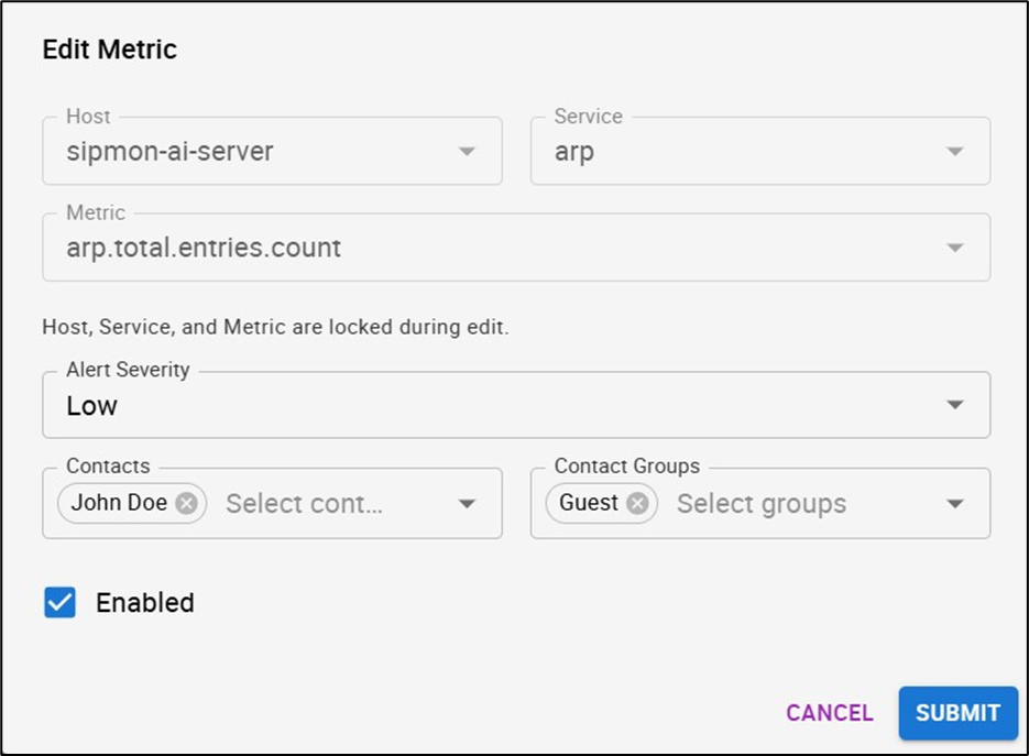 Figure: Edit Metric Details
Delete Metric: Remove unused metrics to clean up the configuration and reduce noise in anomaly detection alerts.
 Figure: Delete Metric Confirmation
Enable/Disable Metric: Activate or deactivate a specific metric without deleting it, offering flexibility for temporary monitoring pauses.
 Figure: Enable/Disable Metric Toggle
Contact Management: Assign individual contacts or contact groups to receive alerts based on severity and metric conditions.
 Figure: Assigning Contacts for Alerts
Alert Severity Levels: Define alert priority as Low, Medium, or High to classify anomaly importance and escalation needs.
 Figure: Alert Severity Level Selection
Adding a New Metric
Follow these steps to configure a new metric for anomaly detection:
Initiate Creation: Click the + (Add Metric) button above the metric table.
 Figure: Add Metric Button
Configure Fields: A popup window will appear. Complete the fields in the following order:
 Figure: New Metric Configuration Form
Host: Select the target host from the dropdown list.
 Figure: Select Target Host
Service: Choose the related service linked to the selected host.
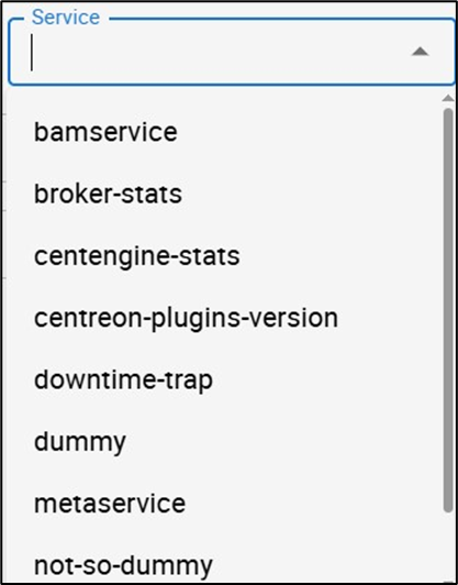 Figure: Select Related Service
Metric: Select the specific performance metric to monitor.
 Figure: Choose Performance Metric
Alert Severity: Set the alert level (Low, Medium, or High).
 Figure: Define Alert Severity
Contact(s): Choose one or multiple contacts to notify.
 Figure: Select Alert Contacts
Contact Group(s): Select one or multiple contact groups for broader notifications.
 Figure: Select Contact Groups
State: Enable or disable the metric as needed instantly.
 Figure: Set Initial State
Save: Click Submit to save the configuration or Cancel to discard changes.
 Figure: Save Configuration
Managing Existing Metrics
Edit: Click the Edit icon in the metric table to modify metric details or alert assignments.
 Figure: Edit Metric Action
Delete: Click the Delete icon to permanently remove a metric entry from the system.
 Figure: Delete Metric Action
Quick Anomaly Graphs
The Quick Anomaly Graphs feature provides a fast and visual method to analyze system performance trends and identify anomalies in real time. This functionality generates multiple graph types—including Actual vs Predicted Over Time, Cumulative Trend Over Time, and Anomaly Severity Distribution—for deeper insights.
 Figure: Quick Anomaly Graph Dashboard
Features
- Dynamic Visualization: Quickly visualize anomalies and performance deviations.
- Multiple Graph Views:
- Actual vs Predicted Over Time: Compare real-time performance values with predicted baselines.
- Cumulative Trend Over Time: Observe long-term performance accumulation trends.
- Anomaly Severity Distribution: View the proportion of detected anomalies by severity level.
- Customizable Filters: Select specific hosts, services, metrics, and time ranges to refine analysis.
- Date Range Picker: Define the desired start and end dates for specific period analysis.
- Instant Generation: Generate graphs dynamically by clicking "Get Anomalies", with real-time results.
Accessing & Generating Graphs
- Navigate: Open the Anomaly Detection page and scroll to the Quick Anomaly Graphs section.
- Configure Filters: Select the parameters in the following order:
- Host: Choose the host to analyze.
- Service: Select the associated service.
 Figure: Select Service for Graph
 - Metric: Pick the specific metric (e.g., CPU usage, response time).
 Figure: Select Metric for Graph
- Set Time Range:
- Select the Start Date.
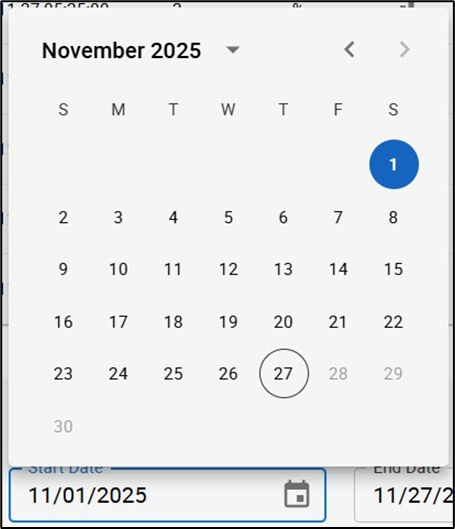 Figure: Start Date Picker
 - Select the End Date.
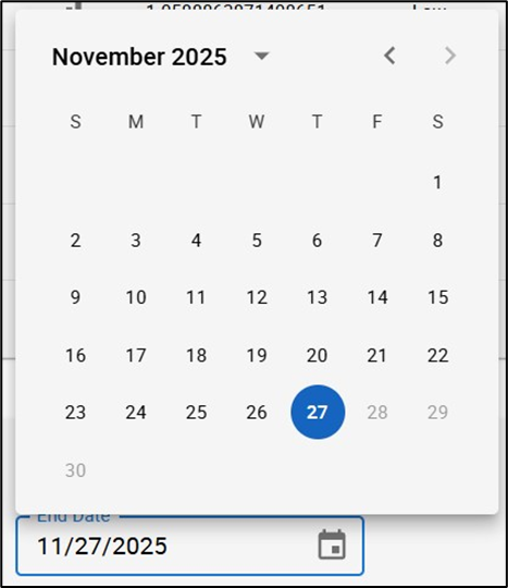 Figure: End Date Picker
- Select the Start Date.
- Generate: Click the Get Anomalies button.
 Figure: Generate Graph Action
The selected graphs (Actual vs Predicted, Cumulative Trend, Severity Distribution) will be displayed automatically after processing.
Summary
The Quick Anomaly Graphs feature offers an efficient way to visualize system anomalies without complex configuration. By selecting key parameters coverage, users can instantly generate interactive graphs that highlight deviations, predict trends, and assess severity distributions for informed decision-making.