Graphs
Definition
SIPMon utilizes monitoring data to generate visual graphs, providing key insights into system metrics. There are two primary categories of graphs available:
Performance Graphs
Performance graphs allow for the intuitive visualization of service evolution over time. These graphs are essential for tracking metric-based data.
- Examples: Hard disk capacity usage, network traffic volume, etc.
- Structure:
- X-axis: Time period.
- Y-axis: Unit of measurement (e.g., Volts, Octets).
History Graphs (Status Graphs)
History or Status graphs display the chronological evolution of a service's status. Unlike performance graphs, the vertical axis does not represent a variable magnitude but rather the state of the service.
- Structure:
- X-axis: Time period.
- Y-axis: Constant.
- Status Indicators: The status of the monitored object is indicated by color-coded segments:
- Green: OK status
- Orange: WARNING status
- Red: CRITICAL status
- Grey: UNKNOWN status
Example of Performance Graphs: 
Figure 3: Performance Graph
Visualization
Performance Graphs
There are several ways to view Performance Graphs:
- Viewing the graph in the list of services (Monitoring → Services) by mouse-over the icon .
- Viewing the graph from the page of details of an object by clicking on View graphs for host.
- Go into the menu: Monitoring → Performances to view multiple graphs.
Status Graphs
In the same way as for the performance graphs, there are several ways of accessing Status History Graphs:
- From the detail page of an object (see the chapter covering real time monitoring)
- From the menu: Monitoring → Performances, by first selecting a specific service and then checking the Display Status box
Viewing Multiple Graphs
To view all graphs, go into the menu: Monitoring → Performances
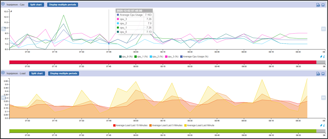
Figure 4: Performance Graph
- All the filters on the top of the page allow selecting the graph one wants, for a time period one wishes to.
- The option Hosts show all graphs to all hosts linked.
- The option Services show only graphs of the selected services
- The option Graph Period can be used to select the time period over which one wishes to view the graphs. The drop-down list can be used to select predefined time periods.
- It is possible to choose the time period manually, using the fields, from and to: this replaces the predefined selection.
Actions Possible on the Graphs
- Split components: separates multiple curves of a graph into multiple graphs each containing one curve.
- Display Status: Displays the history graphs linked to performance graphs displayed.
- To use the data from graphs, it is possible to:
- View the performance graphs on a daily, weekly, monthly or yearly basis by clicking on the performance graphs of your choice.
- Zoom in on the graphs by clicking on the icon

Figure 5: Zoom icon - Back-up the graphs by clicking on the icon

Figure 6: Preview icon - Download all the data contained in the graphs in the .csv format by clicking on the icon

Figure 7: CSV icon