Navigate
Step 1: Login
- Login using Alias and Password.
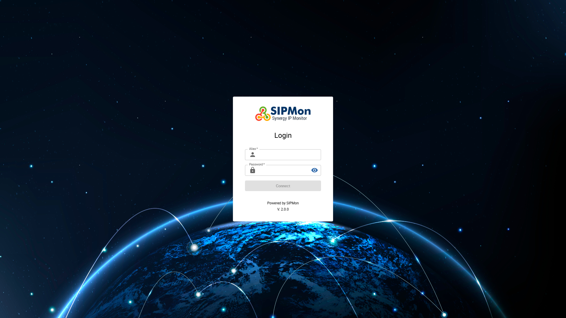 Figure: Login Screen
Step 2: Locate
- Hover on the second icon of the side navigation bar and click on Topology Dashboard.
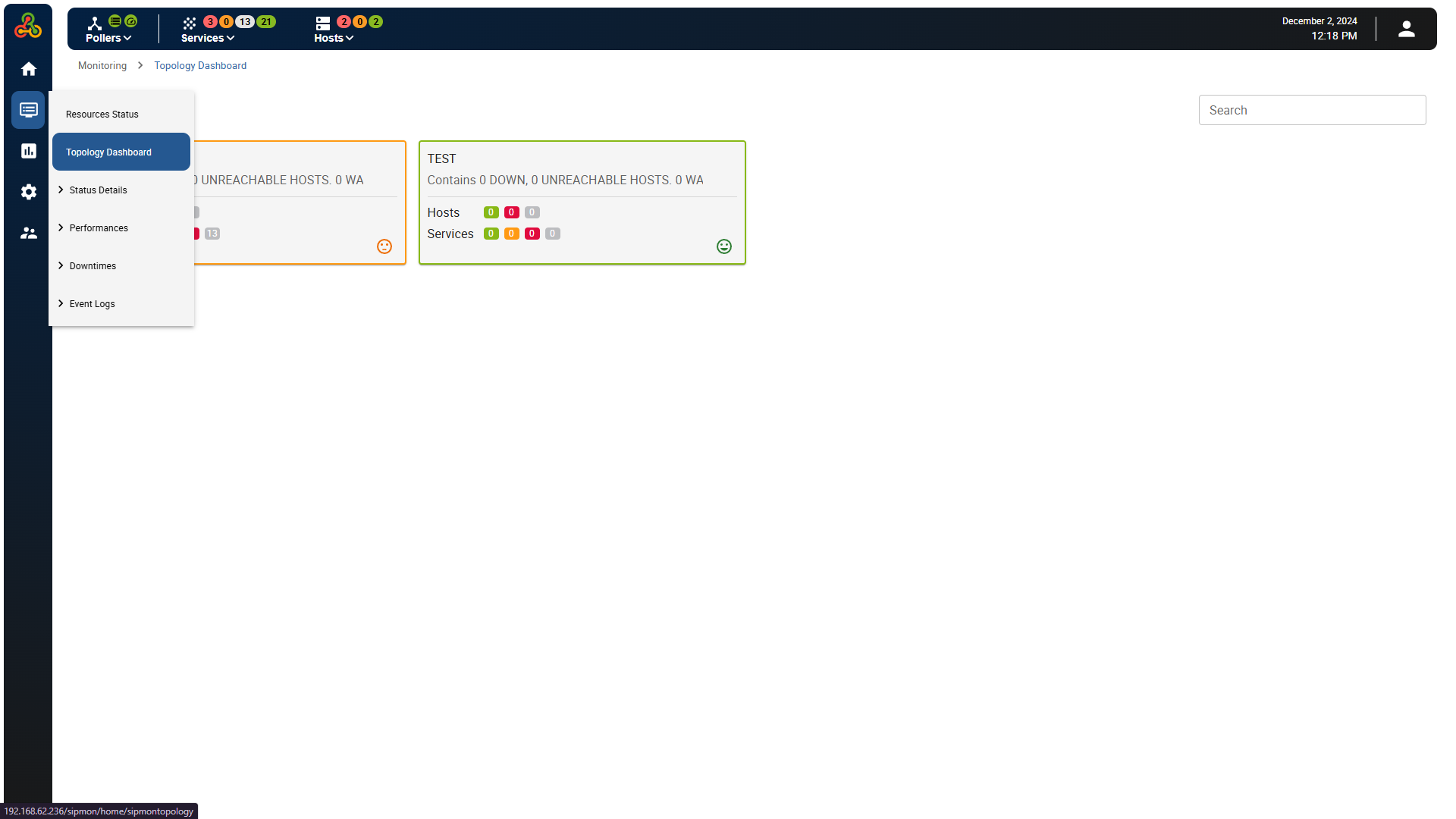 Figure: Navigating to Topology Dashboard
Topology Dashboard
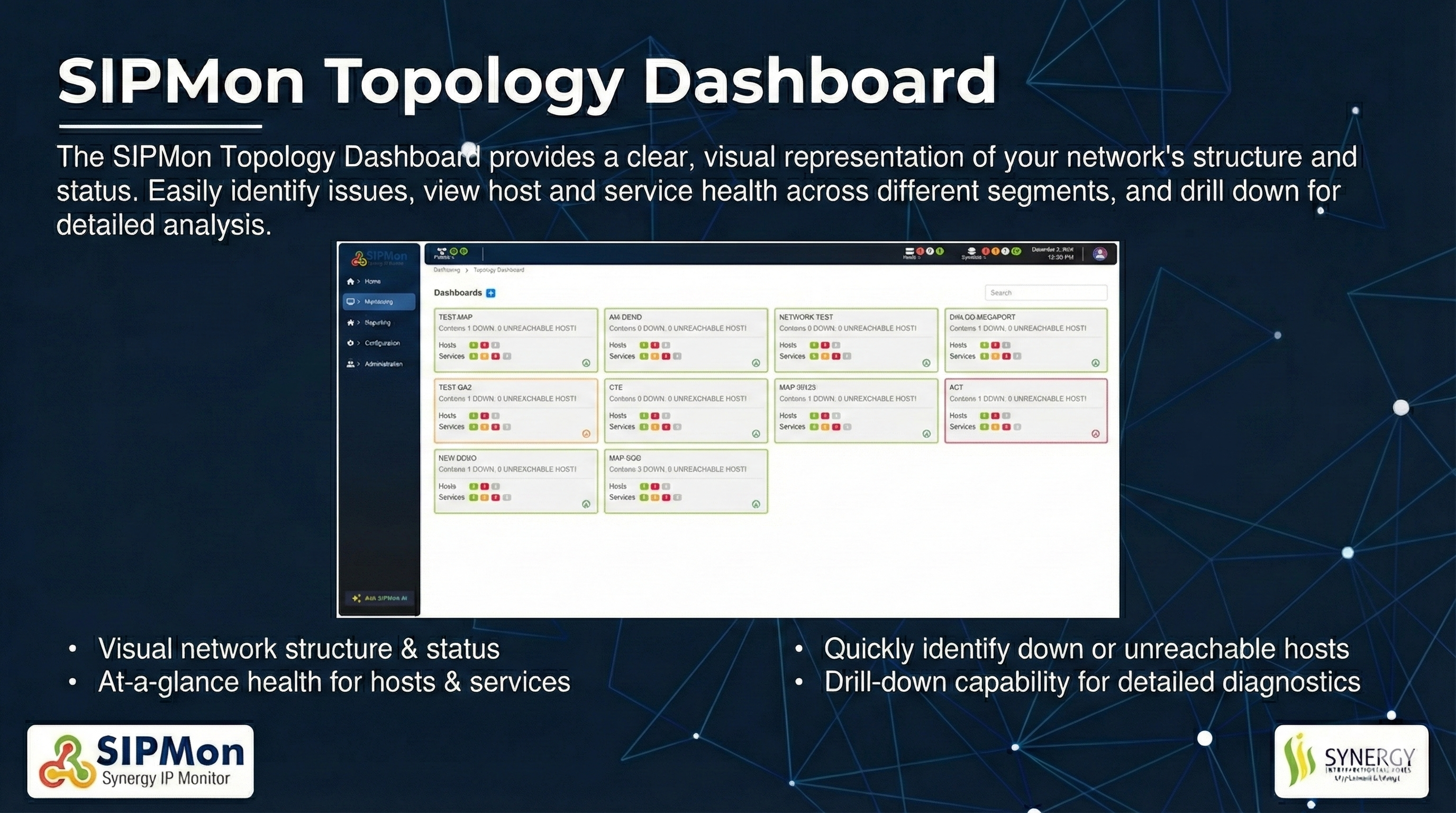 Figure: Topology Dashboard Overview
01. Dashboards
The outline colors of the dashboards visually indicate the status of hosts or services within each dashboard:
Red Outline (Critical Status): Indicates that one or more hosts or services within the dashboard are in a critical state.
Amber Outline (Warning Status): Indicates that one or more hosts or services are in a warning state.
Green Outline (Ok Status): Indicates that all hosts and services are functioning normally with no warnings or critical errors.
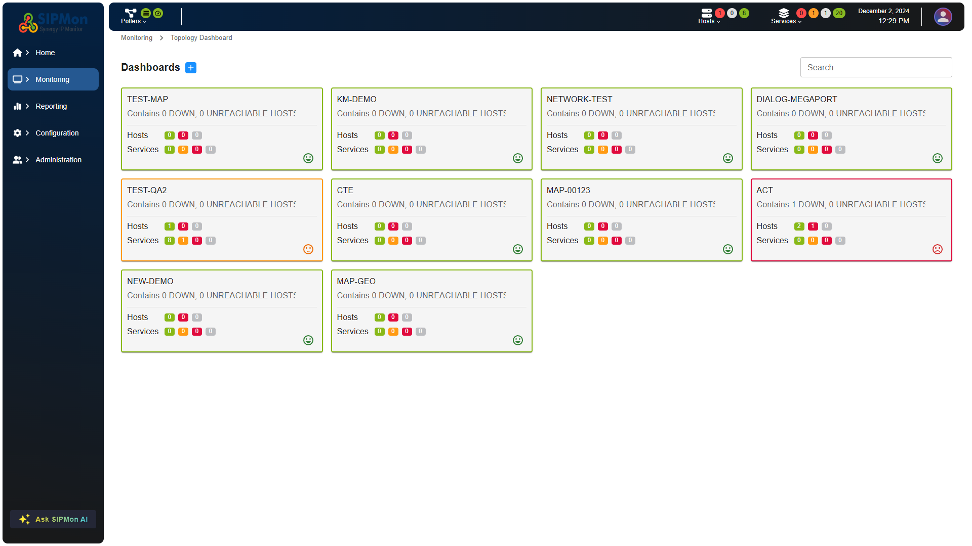 Figure: Dashboard List with Status Indicators
02. Search Option
The search bar located on the top right section in the "Dashboards" section allows users to quickly locate a specific dashboard by entering relevant keywords
Figure: Searching for a Dashboard
03. Create Dashboard Option
The blue plus icon in the top left section of the interface is used to navigate to the "Create Dashboard" page. Clicking this icon typically takes the user to a form or interface where they can configure a new dashboard.
Figure: Create Dashboard Button Location
Create Dashboard
When the blue plus icon is clicked, a Create Dashboard dialog box appears, as shown in the screenshot. Here's how it functions:
Title Input Field: This is where the user can enter the name or title of the new dashboard.
Cancel Button: Closes the dialog box without creating a dashboard.
Create Button: Confirms the action and creates the dashboard with the entered title.
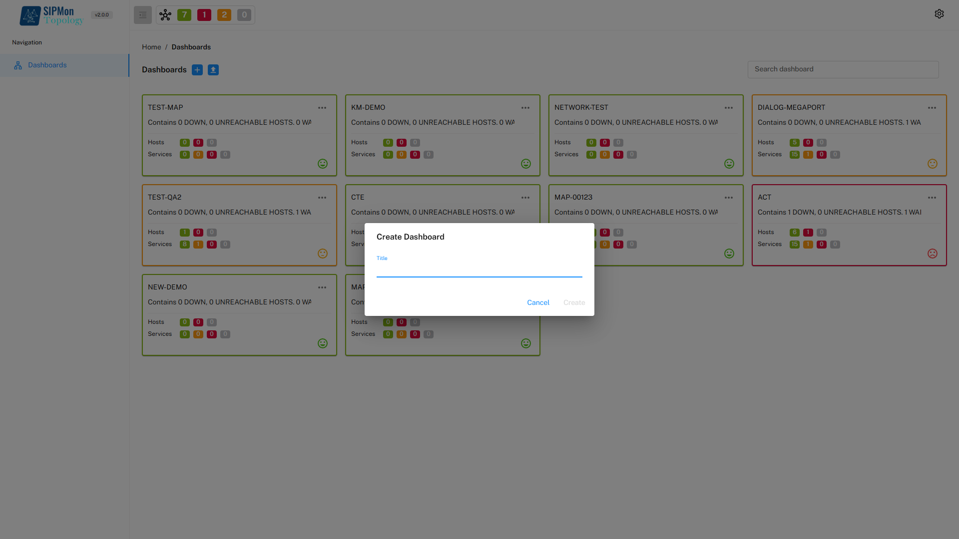 Figure: Create New Dashboard Dialog
Dashboard Objects
1. Basic Shapes
Customization: Helps tailor the dashboard layout to specific needs.
Visual Organization: Enhances clarity by grouping, separating, or emphasizing elements.
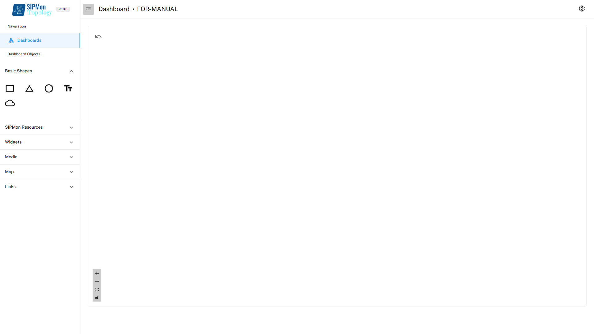 Figure: Basic Shapes Toolbar
1.1. Modify Basic Shapes
Double-Click on the shape in the workspace to open the Modify object menu.
The Appearance Tab in the Customize Menu allows users to modify the visual properties of basic shapes, making them more suitable for the intended design or theme of the dashboard. Below are the customization options available in the Appearance Tab:
1.1.1. Background colour: Allows users to set a fill color for the shape.
1.1.2. Border Color: Enables users to change the color of the shape's border.
1.1.3. Opacity: Adjusts the transparency level of the shape.
1.1.4. Alignment: Allows users to adjust the alignment of the shape within the dashboard.
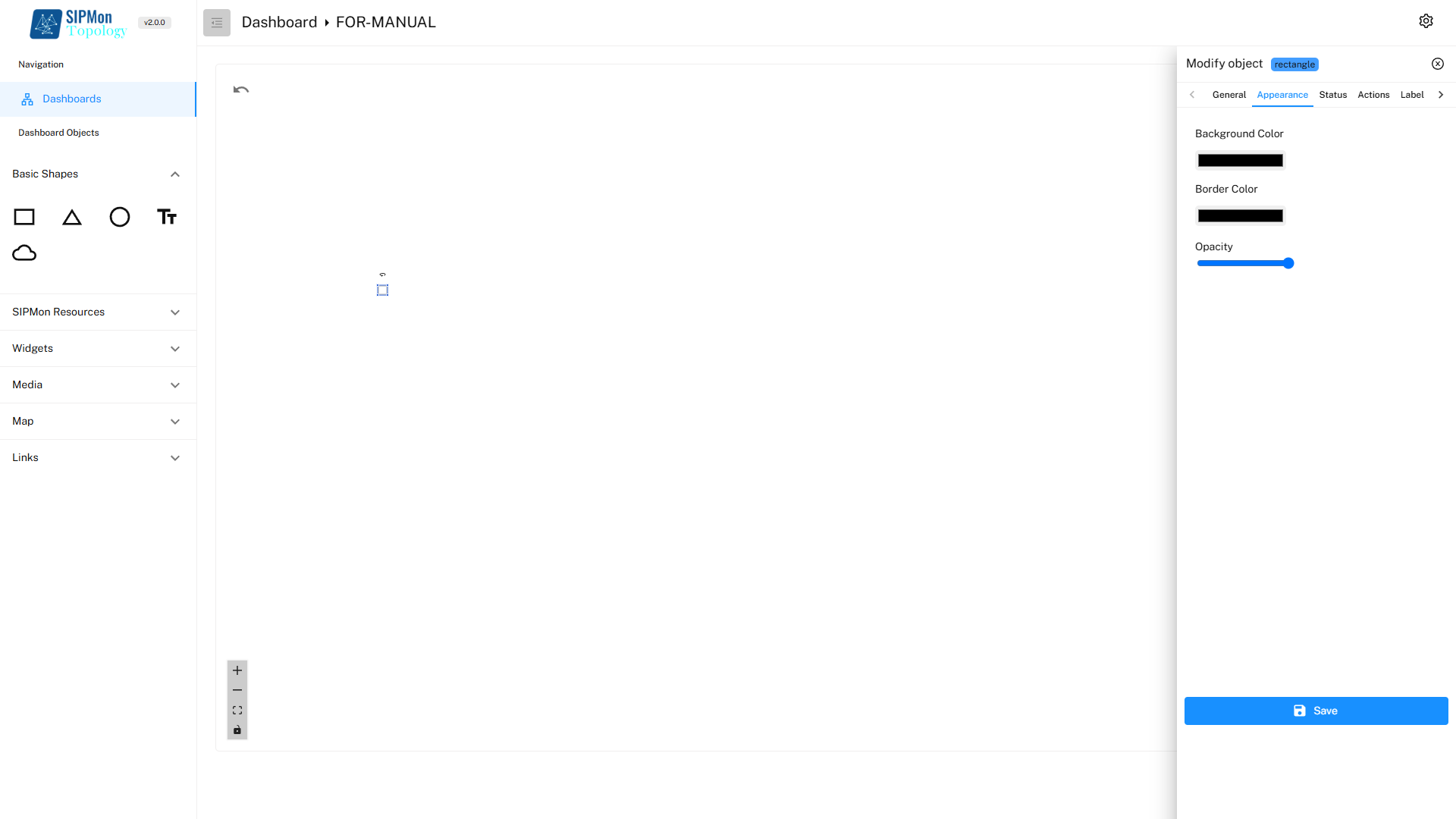 Figure: Modifying Basic Shape Properties
2. SipMon Resources
SIPMon Resources section provides users with essential monitoring objects to populate the dashboard. These resources are represented by icons in the following order: Hosts, Services, Host Groups, and Service Groups.
Centralized Monitoring: These resources allow users to add and organize the most critical components of their network monitoring system directly on the dashboard.
Customizable Views: Users can select specific hosts, services, or groups to create tailored dashboards that align with their operational priorities.
Ease of Access: The intuitive layout of icons makes it straightforward to locate and add resources to the dashboard.
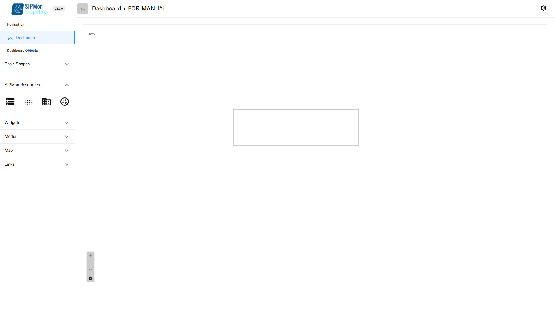 Figure: SIPMon Resources Toolbar
2.1. Modify SipMon Resources
Double-Click on the SipMon Resource in the workspace to open the Modify object menu.
Users can customize the objects such as hosts and services through various tabs available in the Modify Object Menu. These options allow precise configuration and visualization of network elements in the dashboard.
- General Tab:
Host Selection: Allows the user to select a specific host for the host object.
Service Selection (for Service Object): Enables selection of a specific service.
- Appearance Tab:
Icon Customization: Users can change the icon representing the host or service to better match.
- Label Tab:
Custom Label: Allows adding or modifying text labels for the object.
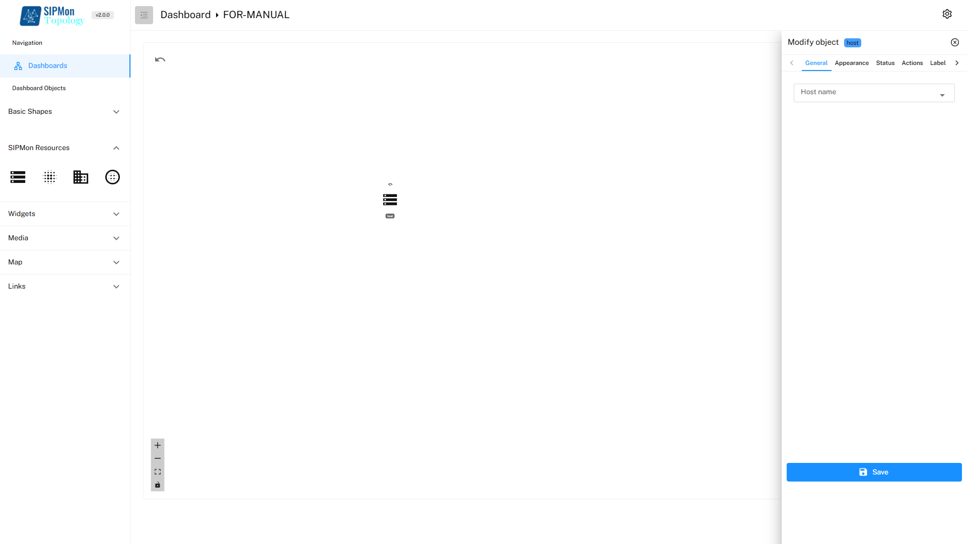 Figure: Modifying SIPMon Resources
3. Widgets
Widgets section provides powerful visualization tools that allow users to present data in a meaningful and visually appealing way. The widgets are represented by icons in the following order: Map, Table, and Metric.
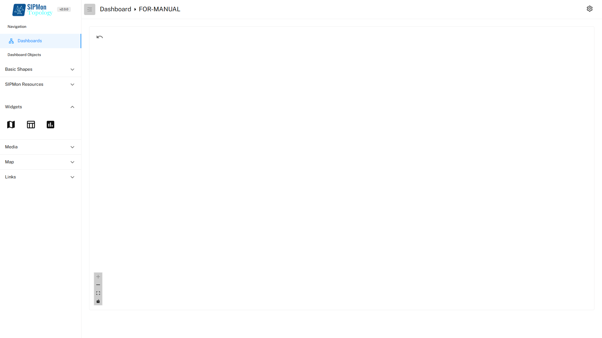 Figure: Widgets Toolbar
3.1. Modify widgets
Double-Click on the Widget in the workspace to open the Modify object menu.
Users can customize the objects such as hosts and services through various tabs available in the Modify Object Menu. These options allow precise configuration and visualization of network elements in the dashboard.
3.1.1. General Tab:
Map Selection: Allows the user to select a specific Map from the exsistinf list of maps.
3.1.2. Appearance Tab:
- Icon Customization: Users can change the icon representing the host or service to better match.
3.2.3. Label Tab:
- Custom Label: Allows adding or modifying text labels for the object.
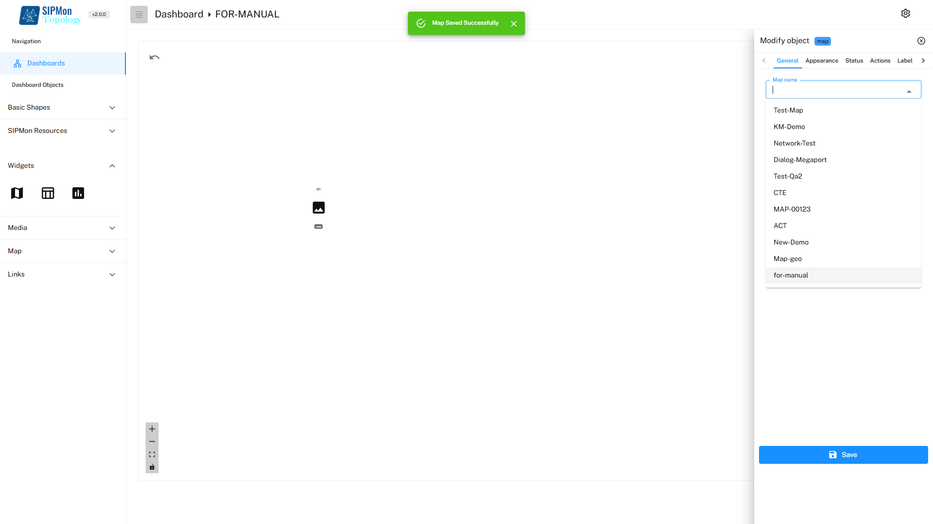 Figure: Modifying Widget Properties
4. Media
Media section includes a Media Button that allows users to insert images into the dashboard.
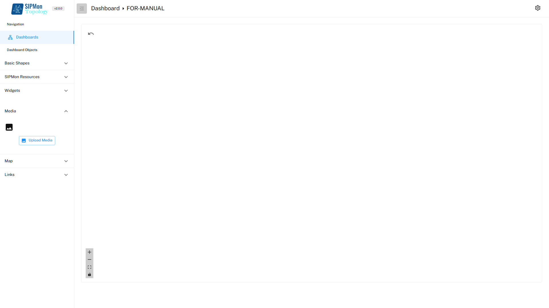 Figure: Media Insertion Tool
5. Map
Map section allows users to add a world map to the dashboard.
 Figure: Map Tool
5.1. Modify Map
Double-Click on the Map in the workspace to open the Modify object menu.
Users can customize the objects such as hosts and services through various tabs available in the Modify Object Menu. These options allow precise configuration and visualization of network elements in the dashboard.
5.1.1. General Tab:
Object Type Selection: Users can choose the type of object they want to add to the map from the following options:
Host: Represents a specific monitored device.
Service: Tracks a specific service related to a host.
Host Group: Displays a collection of related hosts.
Service Group: Shows a group of related services.
5.1.2. Sub-Field Selection:
Depending on the selected object type, additional fields appear to further specify the object:
Host/Service: Choose a specific host or service from the available list.
Host Group/Service Group: Select a predefined group for display on the map.
5.1.3. Icon Set Selection:
- Users can choose from various icons to visually represent the object on the map.
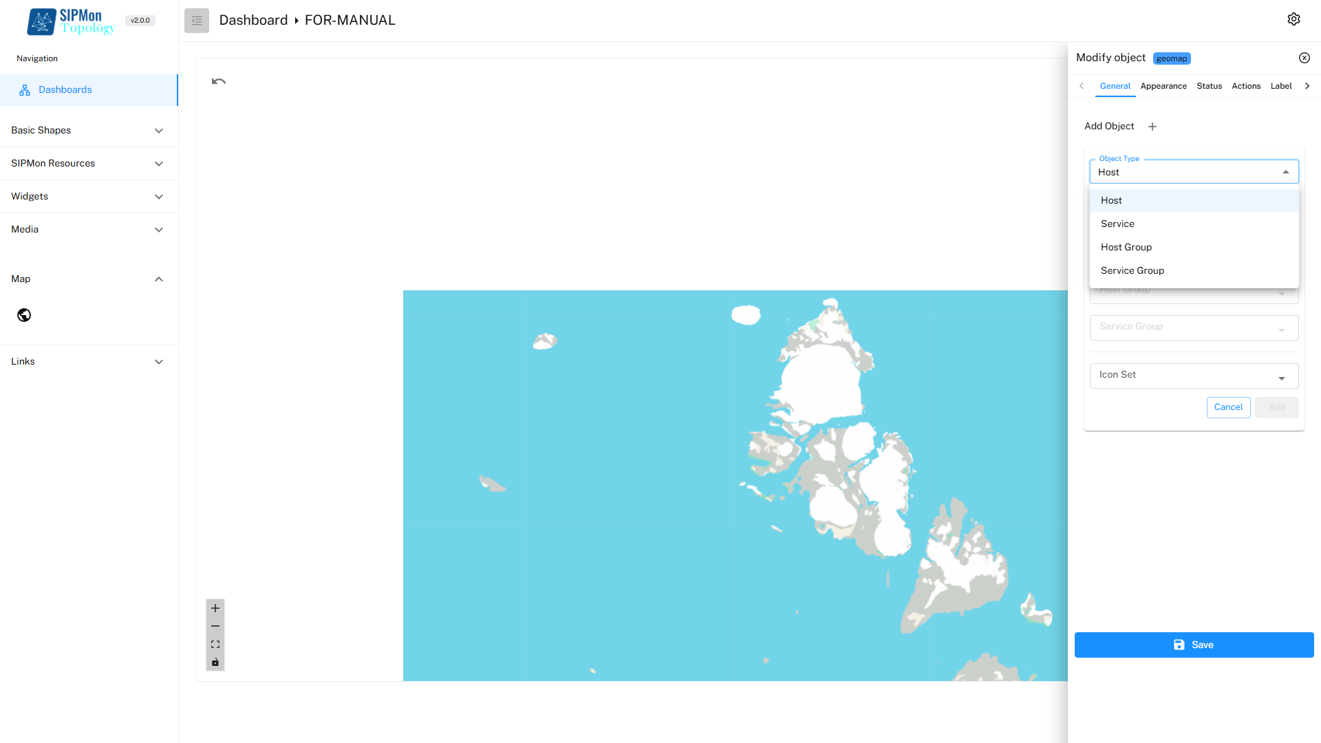 Figure: Modifying Map Properties
6. Links
Links section provides tools to visually represent relationships or connections between objects in the dashboard. The two types of links available are One-Way Link and Two-Way Link, represented by their respective icons.
 Figure: Links Toolbar
6.1. Modify Links
Double-Click on the Link in the workspace to open the Modify object menu.
Users can customize the objects such as hosts and services through various tabs available in the Modify Object Menu. These options allow precise configuration and visualization of network elements in the dashboard.
6.1.1. General Tab:
Object Type:
- Displays the selected type of object for the link, which in this case is Host.
Host Name:
- A dropdown menu allows the user to select a specific host from the list of monitored hosts.
6.1.2. Appearance Tab:
Data Flow Animation:
- Enables animation along the link to visually indicate the direction of data flow.
Stroke Width:
- Adjusts the thickness of the link.
Label Font Size:
- Sets the size of any labels added to the link.
Enable Traffic Updates (Kb/s):
- Activates real-time traffic monitoring on the link, displaying data flow rates in kilobits per second.
Display Traffic (Kb/s & Percentage):
- Shows both the data rate and its percentage utilization.
Allow Custom Label Positions:
- Lets users manually adjust the position of labels along the link for better visibility and alignment.
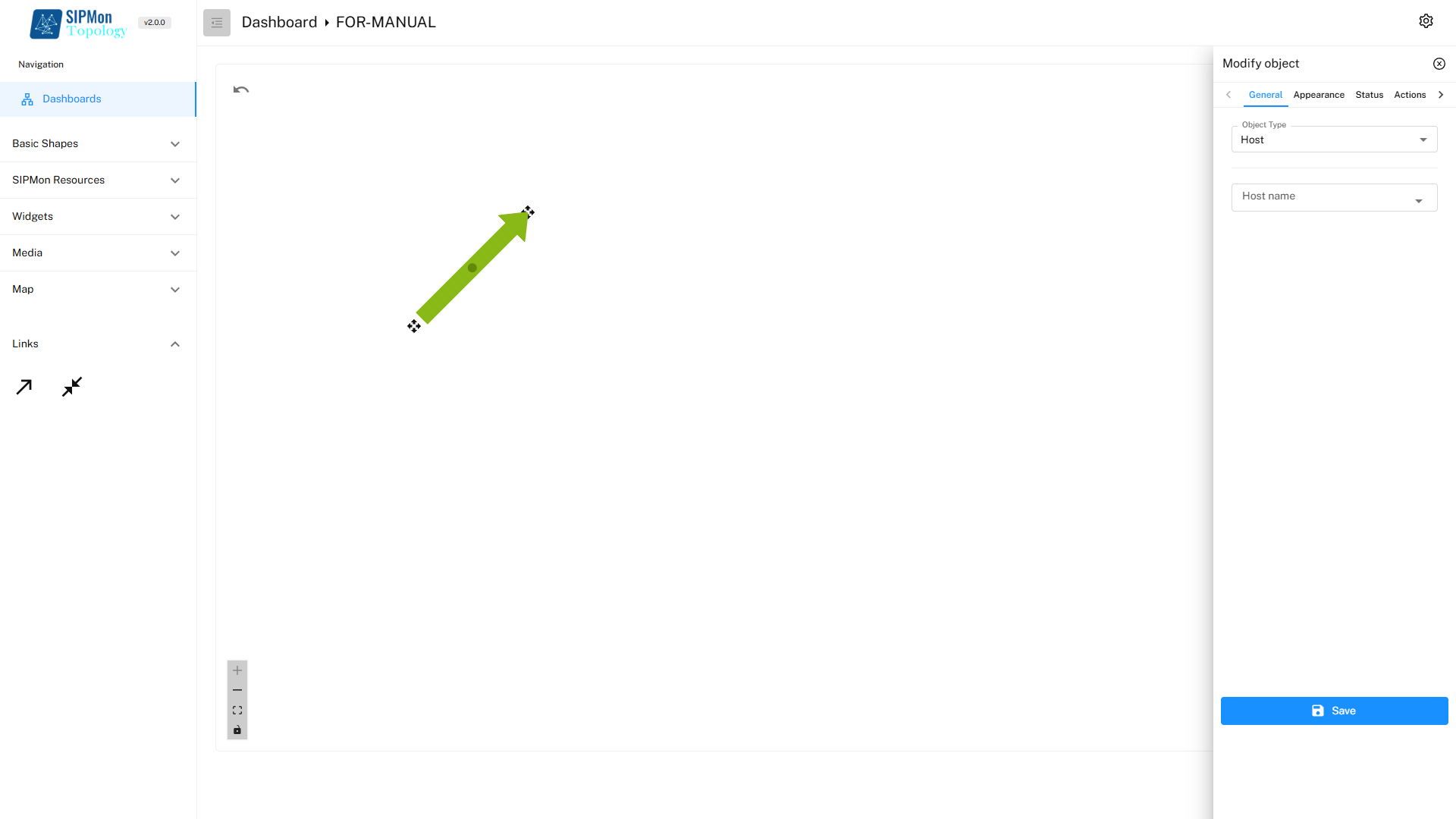 Figure: Modifying Link General Properties
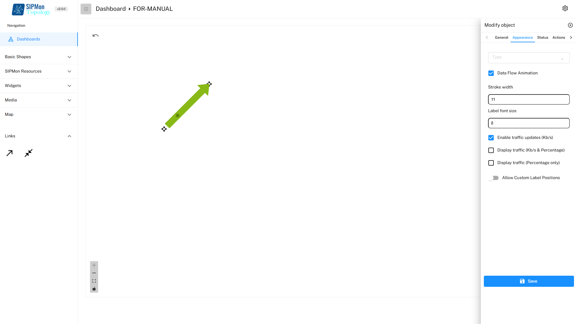 Figure: Modifying Link Appearance
7.Right-Click menu
The Right-Click Menu in the Create Dashboard Workspace provides a variety of options for managing and customizing the dashboard layout. This context menu appears when the user right-clicks anywhere in the workspace.
Refresh: Reloads the workspace to reflect any recent changes. Useful for ensuring that all objects and data are updated without reloading the entire application.
Save: Saves the current state of the dashboard, including all modifications and added elements. Ensures that changes are preserved and can be accessed later.
Paste: Allows users to paste copied elements or objects into the workspace. Facilitates the duplication of shapes, widgets, or links for consistency across the dashboard.
Lock All: Locks all objects in their current positions, preventing accidental movement or modification. Ideal for finalizing the layout of the dashboard.
Unlock All: Unlocks all objects, enabling users to modify or reposition them as needed. Useful during the design or editing phase.
Grid Variant: Provides options for modifying the grid layout of the workspace. Allows users to change the spacing, alignment, or visibility of the grid, aiding in precise placement of objects.
Reset: Resets the workspace to its default state, removing all added objects and customizations. Useful for starting over or discarding unwanted changes.
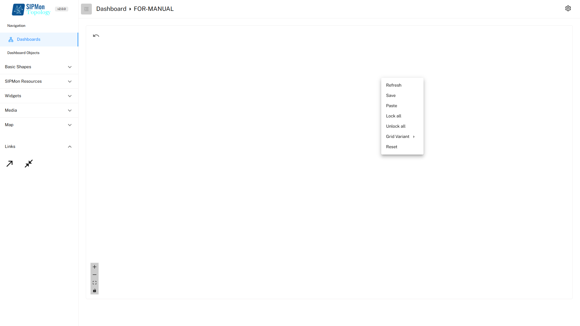 Figure: Right-Click Context Menu